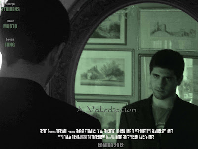
 This is the first draft of our film poster afterour second photo shoot. We tried to match the tone of the main piece of our film by using green, grey and black colours. The font for the title is only temporary, as we will use a custom font in the final piece.
We have followed several conventions of film posters, including using the 'Steel Tongs' font that is universally used on film posters and is instantly recognizable.
