The Shining
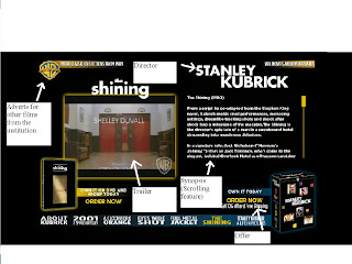
This website of The Shining is from a larger Warner Bros. hub and is sorted by director; it is on the Stanley Kubrick page, who has a heavy influence on the webpage. His name comes up in bold capitals at the top of the page, because the style of The Shining is highly specific to Kubrick and the title-like presentation of the director categorises the film into that style on the website as well.
The bulk of the page is taken up by a trailer and synopsis, the two largest elements of a site in terms of explaining the film to the user. The scrolling synopsis allows the components of the site to be fitted in compactly into one screen, attracting a more casual audience to read it.
As many other film sites are, this is very commercial. The page has several links to buy films from warner bros. and links to other productions on the larger hub, maximising the sales and only providing the basic information.
Our film currently looks like it could lean towards two kinds of target audience. 1: An audience who like coded horror, for example, The Wicker Man, where wilderness and civilisation parallel insanity and sanity as in our teaser. 2: An audience who watch movies like The Grudge, as the lingering image of the girl in the dark is very similair to other contemporary horrors involving young girls as monsters. We will choose one of two very different website styles to direct the film to its target audience, using similarities to films like The Wicker Man and The Grudge to mould that style.

No comments:
Post a Comment