Monday, February 14, 2011

Poster,First Attempts


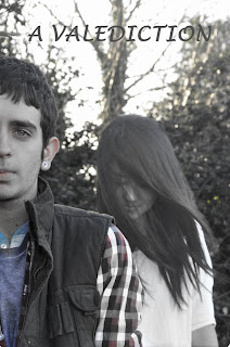
These are our final designs for the film poster. Although we agree that both them would work in targeting our target audience, we decided that we should go with the poster that shows both of the main characters and is more aimed at our target audience.

Wednesday, February 9, 2011

Poster Pictures, Unedited


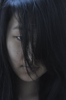
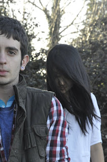
These are some of the pictures that we thought we could use for our film poster; however they have not been edited yet.

Some of the ideas that we had for the poster was that for the picture showing the two main characters we would fade the colour a little to make it look dimmer and have the female character seem as if she was see through and more ghost like. This would then relate back to the main teaser trailer.

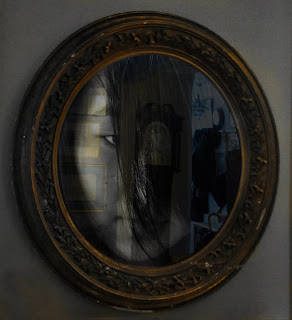
Another idea that we had was that for the other picture of the female characters face, we would add it in to another picture that we took of a mirror to seem as if she was in the mirrors reflection looking out at the audience.

Teaser Take 2 - A Valediction


For our second take on our teaser, we have added a scene to try and connect the character shown in the mirror to the the forest. We have also changed the title screen, although the font we have used IS subject to change very soon. This alludes to the 'Wilderness vs Civilisation' idea that we had when we were first brainstorming for film ideas.

Film Title: A Valediction

After several brainstorming sessions we have decided on a title for our film, 'A Valediction', meaning 'A Farewell Speech'. We feel that this title represents the relationship between the two characters shown in the teaser as well as giving the audience scope to form their own ideas, as it is slightly ambiguous.

The title was inspired by the poem 'A Valediction Forbidding Mourning' by John Donne. This poem was written to his wife before he went to travel around Europe. The first stansa for this poem is:

As virtuous men pass mildly away,
And whisper to their souls to go,
Whilst some of their sad friends do say,
"Now his breath goes," and some say, "No."

This stansa plays on the aspects of death that are uncertain, or unexplained. This is, in essence, the basis for our film. Because of these two meanings we felt that this title was the right one for or film.
Poster: Editing Stage

We have recently come up with a few poster ideas that we think would be good in engaging our target audience. However, we wanted the poster to be as professional as it could be. So we asked one of our friends, Lottie Rider, to help us with the photos as she has a high quality camera and is very good at Photoshop, which is very helpful because we plan to edit the photos to give them a more professional look.

We started out by going into a field and taking a few pictures of the two main characters standing near a wooded area. We thought that this would be a suitable location to take a few photos because part of our film is based in the woods and it would relate to the film. We then decided that we should go to a different location to find some more ideas. Our next location was at a friend’s house where we had originally filmed the trailer, we decided to take a few shots of the mirror because this was a big part of the trailer that the audience could see straight away and relate to. As this went on we thought of the idea of the main female characters face being shown in the mirror, but not as a real person, but as the ghost that is haunting the main character. For this we asked Lottie if she could somehow make it as if she was faded in the mirror to give the ghost like effect.

At the moment we are still in the editing stage so do not have any photos uploaded at the moment, but we are close to coming up with a final idea for our film poster.

Wednesday, February 2, 2011

Poster - Creating the first draft

So far we have conducted some research on film posters, and had some thought of which audience we are marketing our film towards (the 16-24 year old market famously has a large amount of disposable income, and we are trying to tailor our promotional material to appeal to this age bracket). Now we are in preparation for the rough draft of our ancillary tasks, and we realised, for our film poster to be realistic and effective the image we use has to be high quality. For this reason we are getting the help of a friend with a high resolution camera. We plan to take several pictures based around the theme of the girl in the mirror with this camera in the near future, and we think it is a memorable part of the trailer that would stick in the minds of the audience when they think of the film, and this makes it a good theme to market with. We also plan to use editing software such as adobe photoshop to create some effects to make the poster more than just a photograph.