Evaluation on Prezi
Tuesday, April 5, 2011
Monday, April 4, 2011
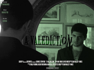
Film Poster

The main difference between the draft and our final poster is the inclusion of an especially designed title. The concept behind this reflects the theme of sanity that is prevalent in the film. It starts out straight and uniform, but slowly changes and turns into something more sinister and deranged. This also fits with the concept of a teaser trailer, as it gives the audience a taste of what is to come without actually telling them anything specific.
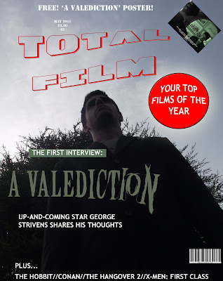
Magazine Cover

This is our magazine cover, created in Adobe Photoshop. We took inspiration from 'Empire' magazine as this is a universally acclaimed and renowned publication. We have continued using the contrasting colours of green and black in order to maintain synergy with both our other ancillary tasks and our main project.
EDIT: The poster was changed to avoid copyright infringement issues - the title is now an original design rather than using the Empire typeface.
Subscribe to:
Comments (Atom)
