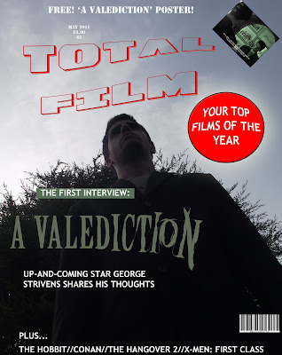
This is our magazine cover, created in Adobe Photoshop. We took inspiration from 'Empire' magazine as this is a universally acclaimed and renowned publication. We have continued using the contrasting colours of green and black in order to maintain synergy with both our other ancillary tasks and our main project.
EDIT: The poster was changed to avoid copyright infringement issues - the title is now an original design rather than using the Empire typeface.

No comments:
Post a Comment