Wednesday, December 29, 2010

Cape Fear (1961)


"Small-town lawyer Sam Bowden's life becomes torturous when Max Cady re-enters his life. Cady went to jail for 8 years after Bowden testified that Cady attacked a young woman. Now that Cady has been released, he begins to terrorize Bowden and his family, particularly targeting Bowden's daughter, Nancy. Initially, Cady uses his newfound knowledge of the law (learned in prison) to annoy the Bowdens, then poisons the family dog... Who's next ?"

After watching this film I noticed some similarities with the plot of our project. Here are a number of things it has in common:
  • A notable disparity between civilisation and the wild
  • A protagonist pursued relentlessly by someone/something from their past
  • Horror based on shock and suspense
  • A final "showdown" set far from the city/home of the characters
A useful thing for our group would be to consider how it presents some of these features. The final scenes where Bowden confronts Cady emphasise the natural setting by having the action take place right in the water and the dense woods, compared to the beginning, which is set almost entirely indoors. We can use this method in our teaser trailer by accentuating how the locations we use are at different places in the narrative, for example something we already know of which is the contrast in colour of the forest shots and indoor shots.

Our teaser already has shock and suspense, but before we are too heavily influenced by the shocks in Cape Fear (such as the camera quickly revealing a woman's bruised face) we have to remember that what was shocking in the early 1960s is not shocking today as we live in a world with films like Hostel and Saw. Obviously cutting off limbs etc. is out of our capabilities in filming but by combining shock with well thought out suspense we can enhance how frightening the shocks are. I think an effective way of building up tension, as we do not have much running time to build a whole set piece, is through music. At present we only have one piece of music, running uninterrupted throughout the trailer. If we alter this slightly and choose exactly where the music shall reach its climax so it is synchronised with the action, the shocks will be more effective. Of course we have to keep our film atmospherically scary as detailed in earlier posts so we cannot overdo this.

Thursday, December 9, 2010

How are features of a film website arranged?


The Shining

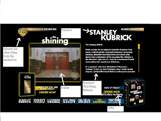
This website of The Shining is from a larger Warner Bros. hub and is sorted by director; it is on the Stanley Kubrick page, who has a heavy influence on the webpage. His name comes up in bold capitals at the top of the page, because the style of The Shining is highly specific to Kubrick and the title-like presentation of the director categorises the film into that style on the website as well.
The bulk of the page is taken up by a trailer and synopsis, the two largest elements of a site in terms of explaining the film to the user. The scrolling synopsis allows the components of the site to be fitted in compactly into one screen, attracting a more casual audience to read it.
As many other film sites are, this is very commercial. The page has several links to buy films from warner bros. and links to other productions on the larger hub, maximising the sales and only providing the basic information.
Our film currently looks like it could lean towards two kinds of target audience. 1: An audience who like coded horror, for example, The Wicker Man, where wilderness and civilisation parallel insanity and sanity as in our teaser. 2: An audience who watch movies like The Grudge, as the lingering image of the girl in the dark is very similair to other contemporary horrors involving young girls as monsters. We will choose one of two very different website styles to direct the film to its target audience, using similarities to films like The Wicker Man and The Grudge to mould that style.

Friday, December 3, 2010

Ancillary Task research - What are the features of modern film websites?

Donnie Darko


I chose this film in particular because it is similair to ours, in that an entity exists in some part in the character's mind. The site creates an unnatural atmosphere by using interactive elements, such as the very first part; Donnie is shown in a fake but believable Windows Internet Explorer pop up, and the viewer has to mouse over a button and click it to proceed. The sequence of orders are unsettling to the viewer because it is as if the film is taking over their computer. This is successful in the sense that it creates an ideal mood for its audience, but restricting because it is time-consuming and difficult to find ordinary information about the film, which would not work for us in our ancillary task as we ideally want to create an initial homepage that links to more specific areas of information about our film.

The Blair Witch Project


This website is much more of a simple accessible site than the Donnie Darko site. First, a few lines pop up: "Celebrating the tenth anniversary..." etc. that would not apply to our film. However, when the user reaches the main page after 20 sec or so of titles, it is very simple; containing headers leading to the areas "Mythology" "The filmmakers" "Aftermath" and "Legacy". These subjects are intrinsic to the plot and concept of the film, and make the website similair to the Donnie Darko site, in the way it shows a log of events involving the forest, for example, which let the ordinarily imaginary content of the film intrude on to the user's computer, the same place they would get information about real life, although the button on the homepage "order now" dispells the illusion and makes the page more commercial, a real fault in the website.

1408


This is a much more conventional movie site. Following the link first takes the user to what is essentially an advertisement, with snippets from reviews and stills from the movie on one page. After clicking the "Enter site" button, there is another page showing the theatrical trailer of the movie, then after this finishes, the poster of the film is the background to the page. The user then has to click "Enter site" again, which takes them to the main site which is pictured above. A "room service menu" contains links to "trailer" "synopsis" "cast & crew" "photos" and "tv spots". It also makes very clear the stars John Cusack and Samuel L. Jackson's names beneath this. The links provide a more casual source of information about the film, most likely targeted at an audience who are interested in the film or have seen it and want to know more, and the links provide some simple information and features for this audience. In contrast to the previous two sites, there is much less content that brings the film into the real life of the user; it is more centric on the commercial interests of the consumer. Considering 1408 was less of a success than Donnie Darko and The Blair Witch project, perhaps the choice of website features was not as much of a success either.

From this research, it seems that films similair to ours in concept and tone can have websites as high concept as the films, and the main aim of these websites is to create an atmosphere that brings the film close to reality. Also, the weaknesses of these websites are that in making a fourth-wall breaking bridge from film to user, it detracts from the movie's identity as a film and its commercialness by not having any black and white sections like "about" "cast" and such. At this stage our website should somehow bridge the gap between commercialness and an atmospheric creation.

Wednesday, November 24, 2010

Wilderness vs. Civilisation

Today we brainstormed to find a title for our film. We thought about what we are going to present in our film and the ideas and meanings we are going to include. We didn't end up with a title but amongst other things we considered how a large part of our film could be presenting the difference between wilderness and civilisation. An obvious way of doing this is by contrasting the character who puts on his suit and the character who camps in the forest, possibly using the theory of binary opposites, which we can write about in the exam; for example wilderness, insanity, and the animalistic against social order, sanity and humanity.
In relation to this we considered the novel Heart of Darkness and the film that it influenced, Apocalypse Now. We thought about relating the camping character to Marlow, the protagonist of Heart of Darkness. We wondered: what draws him into the wilderness? What are his attitudes to it? Does he succeed in finding what he is looking for? Also by referencing these texts our film will have an element of pastiche, and will be more postmodern as a result.

Sunday, November 21, 2010

Progress after first filming session

During our recent lessons we have spent lots of time editing our first collection of footage into a rough edit of the teaser. There were some problems with the footage which we are in the process of solving currently.

Watching back the section where the hand turns off the fuse box was not convincing, because of the texture of the blood on the hand being too gloopy and an odd colour. Also, even if the blood looked realistic, there was an agreement between everyone in the group that the scene did not properly convey the nature of the monster (since it was just a human hand that could not properly be shown to relate to the woman in the house within the restrictions of the shots. Also the nature of the action in this scene did not provide the shock tactics we were aiming for in the final teaser.

To correct this we have pulled the scene altogether. As teasers generally last between 30 seconds and 1 minute and 30 seconds this has provided us with more space to develop the content of another scene which I will describe next.

Our most conventional scene and the most popular scene within the group consisted of a young male character dressing up in a room with the walls covered in mirrors; one minute everything would be normal, and by intersecting this scene with the one set in the forest, we can make the moment where his dead ex-girlfriend appears more shocking with the accompaniment of a very quick fading transition and an alarming sound effect. Because there is no visual description of this scene on the blog as yet, here is a basic explanation (click to enlarge):
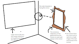


The way that it looks like there are several copies of the girl in the room give an effect of the male character being surrounded. The girl is intended to be a form of the monster, built up from the male character's subconcious, because he is grieving his ex-girlfriend, and she is what he is thinking about at that time which is what creates the particular form the monster assumes. This is what leads to the problem with this shot. At the time of writing, we only have a static sequence where the girlfriend suddenly appears. Our feedback after showing this to our teacher was that if she was a construct of his mind (to some extent), we have not made this clear in what we have filmed so far.

To solve this we could do a number of things. After some research, a common way of taking the viewer into the character's mind is a close-up shot. But we could take this further by zooming in to the character's face (or even their eye, for example if we were to be explicit in showing this is in the character's mind) and when the shot reaches the level of zoom we want it to, the shot can suddenly change and reveal the girl, making it clear that after we have passed through the character's mind, we see what he imagines.

Alternatively, we could use editing to solve this problem. Warping the shot or soundtrack in a very subtle way could give the effect we are looking for, by distorting the reality of the shot which we have at the moment, the audience can tell it is being skewed in some way and the obvious assumption is that the character's mind is perceiving events that are not reality.

The camping/forest scene that was partially described in the storyboard post was believed to be effective by our group and teacher, but one issue was that it would have been a lot more unsettling and conventionally frightening if it was shot at night. Our experiences last year of filming at night were that we needed some kind of low-key light source to make sure that the fact it is being lit is not distracting from the action. The location of the camping scene was far from any street lamps or unnatural light, so it is very difficult to make it light enough to see, but not look like it is artificially lit. Currently we are thinking of re-filming this scene as well, by adjusting the white balance on the camera we think it will enable us to shoot a visible scene at night.

Aside from these main issues, there are instances in our footage where a camera is visible in a reflective surface, for example. To iron this out at the editing stage compromises other elements of the shot if we are cropping, so we have decided to film this section again. This also gives us a chance to improve the connection between the two characters in the sequence and give a greater sense of the action happening in the male character's mind.

Wednesday, November 17, 2010

Horror/Thriller Poster Research


Horror is one of the least respected genres of cinema, and yet it portrays much of today’s culture and values within its context. These movies show heavy symbolism, especially in the portrayal of women and femininity, through images of fear of castration, and the strength of females. Horror films are famous for portraying women as damsels in distress who are usually murdered within the first five minutes as punishment for their indiscretions. They are also portrayed as antagonists, which can be seen as a reflection of men’s pathological fear of women. Horror is a genre that rarely features women in a non-exploitative way, even with modern movies such as the new ‘Friday the 13th’ being extremely sexist.


There are however positive female characters in this genre and these films are usually much more respected by critics and the public. In movies such as ‘The Descent’ and ‘A Nightmare on Elm Street’, women can be seen defeating typically male villains and exhibiting strength and intelligence, moving from victim to heroine.

The female subject is shown in horror movies in different ways through time. Women are beginning to come into their own in the horror genre, showing that they are as strong as men and are not the sexual objects they were once perceived.

Wednesday, November 10, 2010

Hammer Horror

Hammer Horror studios was very prominent in the 1950s through to the 60s and early 70s. During this time they produced dozens of films that redefined the genre. One of the most famous stars of this era was Christopher Lee who took up the mantle of Bela Lugosi in playing Dracula. The studio bridged the gap between black and white films and technicolour. The films were groundbreaking and controversial in the amount of blood and gore that was shown on screen resulting in many of the films being heavily censored, or even banned.

In modern horror films the influences of Hammer are clear to see, from the camera shots to the music to the now classic clichés that have been used over the years. The studio recently released its first horror film for over 30 years after going bust in the 1980s.

In terms of Hammer's influence on our film and how it could be similair or different, Hammer films are generally overtly melodramatic. This aspect of style would be out of place in our teaser because we want to create a serious and genuinely frightening atmosphere, but the bold visual style of Hammer films could work for us because it would be ideal for us to show some blood and gore as they are so famous for doing so that the film can easily be identified as a conventional horror in that respect.

The Male Gaze

Powerpoint of the Male Gaze

This powepoint describes what the Male Gaze is and how it links in with movie planning.

The art of film title design


Hitchcock by Matt Terich


This font is useful for making a similair impression to the start of Hitchcock's films. It can work as both a typographical homage to his films or to make the following film fit into the classic thriller genre more easily, which might work for us but our film is not purely a thriller nor is it in the classic style, so the font would be at odds with the content.


Meyer two by Louis B. Meyer


This font could be appropriate for our film; in particualr the regular capital line saying "OCEAN VOYAGES" or the one saying "MAGNA CARTA". The reason for this is that because of the thin lettering and the similair size of each letter, it is clear and draws attention to the title; it is easier to read, so subconciously people are more likely to pay attention to it. It also seems timeless, and not specific to one person, which is important to our piece as the occurences in the plot happen to different people. Futura by Paul Renner
This is ideal for our film for the same reasons, but because it is Stanley Kubrick's font of choice. The advantage of this is that people who see the font in our film could be reminded of films like The Shining, which is another movie in which the character has a "monster" (in this case the presence in the Overlook hotel) that exists in part because of their mind processes. Despite this font suiting our film it is only available for sale but it gives us an idea of what we are looking for.


Monday, November 1, 2010

Film Monster Concepts

During a media lesson we brainstormed various ideas of what the monster in our film could be. We wanted to produce a high concept film, so we ruled out any kind of traditional monster, i.e. Godzilla, King Kong etc. and instead decided to feature a monster that takes the form of the victims subconscious thoughts. This is similar to the Mexican myth of Chupacabra, which Finlay has described in a blog posting below.

Wednesday, October 27, 2010

Storyboard Progress

Today we had a meeting concerning the storyboard, which we hope will be shot over this evening and tomorrow. The main challenge was to make the concept of the film as clear as we could, while also introducing settings and characters that would be built on in a full version of the film. Also, we thought about how we could implement theory into our teaser trailer. We thought about doing so through a character but we felt due to the nature of a teaser trailer, the characters would not get enough time on film to be properly formed, and in turn it would be difficult to use them as a way of giving the film a marxist perspective for example.
However, there is one character who has the most coverage, and his setting (camping in a wooded area) would be useful to show a life without money and luxury. This could be a step to making this character a means of showing a marxist viewpoint.

Tuesday, October 19, 2010

Locations for a Horror/Thriller Movie

This is a great website to learn about all of the best locations to film a Horror/Thriller movie. Locations

Codes and Conventions of a Horror/Thriller Movie

The conventions of the Thriller/Horror genre are to do with sound and editing. E.g. quick cuts and camera angle changes, music that gives tension when appropriate. It can be do with lighting, especially the use of shadow. Mirrors and stairs are also conventions of thriller movies.

The codes and conventions are mainly what the audiences expect to see within a thriller, this includes all types of thrillers, such as cross genres, such as action, adventure, sci-fi etc.

What audiences expect to see is what producers need to include in attracting their audience. The codes and conventions within a thriller mainly allows a female protagonist to be a victim of a dominant male character, this enables the audiences to familiar themselves with the stereotypes as females are always vulnerable dependent victims, and the dominant male figures as being dominant.

Psychological thrillers which are sub genres play with audience’s minds by manipulating a character or a plot to keep audiences guessing. However cross thriller genres involving adventure and sic-fi; use a slightly different way of using codes and conventions as there are not many ways to engage audiences. For example within a thriller, in a scene where it is scary and engaging, it will be more likely to see dark colour's so the scene can be represented in a way that audiences expect to see it, also the sound which would be loud and intense.

Sunday, October 17, 2010

Saturday Night and Sunday Morning Film Poster


This is a film poster I made for the film Saturday Night and Sunday Morning. The main purpose of the poster was to refer to the metaphorical significance of the 2 elements of the title, (i.e. Saturday Night as one part and Sunday morning as the other). Personally, my reading is that the time of Saturday Night is symbolic of the exciting aspects of the main character (Arthur Seaton)'s lifestyle; going out to pubs and events, and his carefree approach to his love life. In contrast Sunday Morning represents facing up to the reality of what has happened, particularly Brenda becoming pregnant as a result of her affair with Arthur in addition to the connotations relating to "the morning after".

To this end I used the colour and font of the text on the poster as a motif for these metaphors. Albert Finney's (who played the character of Arthur) name and the words Saturday Night are in a modern font and easygoing colour, and placed high up structurally to signify the nature of Arthur's character and his light-hearted "Saturday Night" activities. Whereas Rachel Roberts's (Brenda's) name and the words "Sunday Morning" are in a more sensible font, a deeper colour, and in a lower position. I felt that this reflected the harsh, underlying truth which Arthur has to face in the film. In addition the word "and" and the name Shirley Ann Field (who plays Doreen) are a halfway point between the two other opposites.

Also, the picture of Arthur working in the factory displays how his character is so iconic. He is a northern working class man, shown by the factory in the background, who defies his humble stereotype by having so much audacity and doing whatever he wants. This is summarised by his appearance; the slicked back hair, the cigarette and upturned collar convey someone with an anti-establishment viewpoint.

In relation to our coursework task, making this poster has given me experience that I can put to use in the Ancillary Task, namely the significance of using text and images in a film poster.

Friday, October 15, 2010

Creativity theories

Creativity can come from a very basic idea and then branch out into different areas. This comes about by Beachcombing, as explained in Pete Fraser's blog, a technique in which aspects are taken from other texts and the collective influences form a detailed idea for the person doing the beachcombing.


A similair tactic is the story dust method, which is mainly an analogy in the form of a star growing. Matter gathers gradually over time, and the larger the mass gets, the more is drawn towards it. The metaphor applies to creativity by the space dust representing small ideas which can be written down on cards or paper, which then results in an overall idea when all the "cards" are composed in a good order. The method is explained in Tim Clague's blog.

(Whole group post)

Famous myths

Chupacabra

The Chupacabra (from chupar "to suck", and cabra "goat") is a "cryptid" (an creature whose existence is unconfirmed but has been suggested) that has been found in many locations in the Americas. The animal has a reported habit of killing and draining the blood of livestock, especially goats. It is rumoured to be a heavy creature, the size of a small bear, with a row of spines reaching from the back down to the tip of the tail. The main source of sensationalism comes from the conditions of the corpses left behind. Sheep were found with 3 puncture wounds in the chest and left completely empty from blood.
We could bring this to our idea by forming the character's perception of the film's "creature" by the effects it leaves on its surroundings; possibly by the people or animals it kills to the destruction or clues it could leave in its path. The different things characters find would help to make their individual perceptions of the creature more varied.

Yōkai

Yokai are demons from Japanese mythology. They relate to our plot idea because a group of them called Henge, a kind of shape-shifting animal who imitate humans, mostly women. The legends could have some significance to characters in our film who are aware of the Henge myths, for example, someone Japanese or someone from the new stereotype of western people obsessed with Japanese culture. They could bring an approach to tackling the creature in the film that would help us form a narrative arc for that character.

Hybrids

Hybrids are combinations of different parts of naturally occuring animals. Examples are centaur (human and horse), gryphons (bird and lion), and mermaids (obviously, fish and human). These could be valuable influences to our film idea because it could be a way for characters ti visualise the creatures by piecing together things they are familiar with in real life to create something new. If we felt like going even further we could use this metaphorically as a subtext, referring to the process of making a high-concept film.

Possible Narratives/Plots

Our film will be probably be a crossover of the thriller and horror genres. To achieve this on a low budget we must create a 'Blair Witch Project' type film that focuses more on atmosphere and characters than on expensive special effects. Our group has also been thinking about myths and legends that could be adapted to a modern environment To this end, I have been thinking about some potential plots that could be realistically achieved on a very low budget.

Plot 1
A man, recently divorced for unknown reasons, is being admitted out of an institution that reminds us of a hospital; but something doesn't seem right. After he returns home, he starts to hear a soft singing coming form his garden. He investigates, but finds nothing.

Several weeks later, he again hears this singing, but this time it is accompanied by a silhouetted figure. We follow the character as he explores this unnatural phenomena and along the way, explores his own mind.

Plot 2
A body is lying, motionless on a field. We then see someone running from this field, back towards civilization. This is left ambiguous for now, although we return to the scene at the end of the film.
The person running has been living alone for several years, only maintaining contact with a few good friends.

As the film develops we discover more about this persons past and the demons that haunt it. These demons reemerge following a strange encounter and events eventually escalate up to a murder of a trusted friend. The repercussions take a huge psychological toll and the main character and they deteriorate into a nervous wreck.

Although these plots are extremely ambiguous and need significant development, they are achievable on a low budget and could be adapted to encompass many different theories and myths.

Sam Halsey-Jones

Trailer examples

High-concept films are an ideal genre for making a teaser trailer, here are some successful examples of such films, with Cloverfield in teaser form.

Jumper


Cloverfield


Inception


FB

Possible Music

For this film / teaser trailer we are hoping to create our own music for it. So far we have a brief idea of what this might include. In the style of Pink Floyd it'll have to be slightly spaced and strange to say the least. to achieve this we'd used a ping pong delay but with the dry element reduced to nearly nothing, this would create the effect we need, making the music pan from left to right with delay, and whilst this is occuring, there would also be a lexicon ambient reverb under it, creating a huge spaced affect, this combined with the ping pong delay would with no doubt create the sound needed. The type of music you'd use with these effects would be extremely simple. No fancy dominent major 13 chords, just the root note with the 9th, nice, simple but effective.

G.Strivens

Media Film Ideas

Genre: Horror/Thriller

Subjects that we may hint at during the teaser trailer:
• Marxism/Feminism
• Myth
• Theorists
• Binary Opposites
• Narrative Arcs
• Stereotypes/Countertypes
• Mise en scene
• Realism
Plot Ideas:

• Creature may have infected the persons mind (may not have to show creature but make some hints that it could be seen)
• Main character can sense it in everyday life, but doesn’t know is it is real or just imaginary.
• Main character may have a brain disorder that hasn’t been discovered yet
• That the creature is real but is said to be from a myth, so it hasn’t been discovered yet in the animal kingdom.

Characters:
• Between two/three characters

Produced by Oliver Musto

Friday, October 8, 2010

High concept films and their restrictions

The Fly, 1986

The concept in this film is of a transporter, and when the inventor uses himself as a guinea-pig to test his machine, his genes are combined with those of a fly which entered the transporter just as it began to operate. The effects used in the teaser trailer are out of our group's reach financially and technologically, (e.g. explosions, smashing glass, zapping computer graphics for the title) but we can cheaply achieve other effects as shown here or here. Were we to use these amateur special effects, we wouldn't be restricted by genre. We could make a laboratory background through greenscreen for medical sci-fi, use colour passing to make our film conform to the style of films like Sin City for a noir / comic book / thriller, and reversing film or using blood pouches if we wanted to shoot a punch or other dangerous stunt for action, science fiction or horror. So producing a trailer for a plot similair to the fly would not be impossible, but we would have to be economical with our effects and use them sparingly.

This webpage also details how the traditionally high-budget sci-fi genre can be achieved for next to no money.

FB