Wednesday, March 30, 2011

New Poster - Draft

This is the first draft of our film poster afterour second photo shoot. We tried to match the tone of the main piece of our film by using green, grey and black colours. The font for the title is only temporary, as we will use a custom font in the final piece.

We have followed several conventions of film posters, including using the 'Steel Tongs' font that is universally used on film posters and is instantly recognizable.

Monday, February 14, 2011

Poster,First Attempts


These are our final designs for the film poster. Although we agree that both them would work in targeting our target audience, we decided that we should go with the poster that shows both of the main characters and is more aimed at our target audience.

Wednesday, February 9, 2011

Poster Pictures, Unedited


These are some of the pictures that we thought we could use for our film poster; however they have not been edited yet.

Some of the ideas that we had for the poster was that for the picture showing the two main characters we would fade the colour a little to make it look dimmer and have the female character seem as if she was see through and more ghost like. This would then relate back to the main teaser trailer.

Another idea that we had was that for the other picture of the female characters face, we would add it in to another picture that we took of a mirror to seem as if she was in the mirrors reflection looking out at the audience.

Teaser Take 2 - A Valediction


For our second take on our teaser, we have added a scene to try and connect the character shown in the mirror to the the forest. We have also changed the title screen, although the font we have used IS subject to change very soon. This alludes to the 'Wilderness vs Civilisation' idea that we had when we were first brainstorming for film ideas.

Film Title: A Valediction

After several brainstorming sessions we have decided on a title for our film, 'A Valediction', meaning 'A Farewell Speech'. We feel that this title represents the relationship between the two characters shown in the teaser as well as giving the audience scope to form their own ideas, as it is slightly ambiguous.

The title was inspired by the poem 'A Valediction Forbidding Mourning' by John Donne. This poem was written to his wife before he went to travel around Europe. The first stansa for this poem is:

As virtuous men pass mildly away,
And whisper to their souls to go,
Whilst some of their sad friends do say,
"Now his breath goes," and some say, "No."

This stansa plays on the aspects of death that are uncertain, or unexplained. This is, in essence, the basis for our film. Because of these two meanings we felt that this title was the right one for or film.

Poster: Editing Stage

We have recently come up with a few poster ideas that we think would be good in engaging our target audience. However, we wanted the poster to be as professional as it could be. So we asked one of our friends, Lottie Rider, to help us with the photos as she has a high quality camera and is very good at Photoshop, which is very helpful because we plan to edit the photos to give them a more professional look.

We started out by going into a field and taking a few pictures of the two main characters standing near a wooded area. We thought that this would be a suitable location to take a few photos because part of our film is based in the woods and it would relate to the film. We then decided that we should go to a different location to find some more ideas. Our next location was at a friend’s house where we had originally filmed the trailer, we decided to take a few shots of the mirror because this was a big part of the trailer that the audience could see straight away and relate to. As this went on we thought of the idea of the main female characters face being shown in the mirror, but not as a real person, but as the ghost that is haunting the main character. For this we asked Lottie if she could somehow make it as if she was faded in the mirror to give the ghost like effect.

At the moment we are still in the editing stage so do not have any photos uploaded at the moment, but we are close to coming up with a final idea for our film poster.

Wednesday, February 2, 2011

Poster - Creating the first draft

So far we have conducted some research on film posters, and had some thought of which audience we are marketing our film towards (the 16-24 year old market famously has a large amount of disposable income, and we are trying to tailor our promotional material to appeal to this age bracket). Now we are in preparation for the rough draft of our ancillary tasks, and we realised, for our film poster to be realistic and effective the image we use has to be high quality. For this reason we are getting the help of a friend with a high resolution camera. We plan to take several pictures based around the theme of the girl in the mirror with this camera in the near future, and we think it is a memorable part of the trailer that would stick in the minds of the audience when they think of the film, and this makes it a good theme to market with. We also plan to use editing software such as adobe photoshop to create some effects to make the poster more than just a photograph.

Tuesday, January 25, 2011

Feedback programme

At the moment our school is taking part in an activity with other schools in which we exchange our teaser trailers so far, and send feedback to the other students based on the coursework mark scheme. This will be very useful for us as it is a source of audience feedback from people we do not know, and will help us to improve our trailer in terms of its effect on a 17-18 year old audience.

Thursday, January 13, 2011

How to create a professional movie website

This step-by-step guide to creating a film website has some useful pointers for our ancillary task. Of course some aspects of it that involve hiring a site-builder or crafting a site with multiple pages wouldn't apply to us because we our task is to create a single page and it will not be involved in the actual internet which rules out having a domain name.

Here is the list:

How to Make Your Movie Website

  • 1

    Identify your target audience and narrow down domain names based on tone, scope, and specificity. If the website is dedicated to a single movie, try to work the title into the domain name. Choose a web host that has hosted other movie sites with something in common with yours, such as genre or style.

  • 2

    Build the technical side of your website with a website building program or by composing HTML or CSS code yourself. (If you feel uncomfortable working with either a program or code, solicit the help of a trained site-builder who can give your site a professional sheen.)

  • 3

    Create an opening (or splash) page to not only greet visitors but clearly express the purpose the film and website. Some dramatic image from the film can only help. This page should include tabs that lead to reviews from reputable sources, videos including interviews and trailers, and, if possible, theater listings.

  • 4

    Insert all the information a casual fan would want to know on tab pages. This would include a list of the cast and production crew (with names spelled correctly), a well-written and compelling description of the premise, a professionally edited trailer, a summary of festivals or other places the film has or will play and production information.

    If your film has been rated, place it visibly, but not prominently, near the production information. If you get reviews, and they're positive, post quotes from them, giving appropriate credit to the reviewer and a link if possible to the full review. If the film has been nominated for any awards, or won any, that information should be on your opening page.

  • 5

    Convert any recorded materials (commercials, interviews, etc.) into a smaller, compressed flash video that will be easier and more convenient for viewers to see. Ease and quality will be very important values to keep casual viewers at your site. Create a design for your flash video player that fits well with your project.

  • 6

    Upload your website with a file transfer protocol. Many web hosts offer this feature, but if they don't you can download an FTP program yourself.


  • Read more: How to Make a Movie Website | eHow.com http://www.ehow.com/how_5592722_make-movie-website.html#ixzz1AuiwmvI8

    The guide describes many aspects that are important for use in our task: Identifying a target audience; a 'splash' page to front the site; dramatic images from the film; tabs leading to reviews, interviews, trailers (and remember to convert these to a compressed flash file so it is quicker to load) and cinema listings (n.b. we do not have to create a target page for these to link to in our task, but it would make for a much more convincing homepage if we were to include pretend tabs); information about production crew and cast; a synopsis of the film.

    The above list details the elements of a proper film website that we can and should use in creating our ancillary task, and in conjunction with what we have learned from looking at existing websites we can arrange the features to be convincing and effective.

    Wednesday, December 29, 2010

    Cape Fear (1961)


    "Small-town lawyer Sam Bowden's life becomes torturous when Max Cady re-enters his life. Cady went to jail for 8 years after Bowden testified that Cady attacked a young woman. Now that Cady has been released, he begins to terrorize Bowden and his family, particularly targeting Bowden's daughter, Nancy. Initially, Cady uses his newfound knowledge of the law (learned in prison) to annoy the Bowdens, then poisons the family dog... Who's next ?"

    After watching this film I noticed some similarities with the plot of our project. Here are a number of things it has in common:
    • A notable disparity between civilisation and the wild
    • A protagonist pursued relentlessly by someone/something from their past
    • Horror based on shock and suspense
    • A final "showdown" set far from the city/home of the characters
    A useful thing for our group would be to consider how it presents some of these features. The final scenes where Bowden confronts Cady emphasise the natural setting by having the action take place right in the water and the dense woods, compared to the beginning, which is set almost entirely indoors. We can use this method in our teaser trailer by accentuating how the locations we use are at different places in the narrative, for example something we already know of which is the contrast in colour of the forest shots and indoor shots.

    Our teaser already has shock and suspense, but before we are too heavily influenced by the shocks in Cape Fear (such as the camera quickly revealing a woman's bruised face) we have to remember that what was shocking in the early 1960s is not shocking today as we live in a world with films like Hostel and Saw. Obviously cutting off limbs etc. is out of our capabilities in filming but by combining shock with well thought out suspense we can enhance how frightening the shocks are. I think an effective way of building up tension, as we do not have much running time to build a whole set piece, is through music. At present we only have one piece of music, running uninterrupted throughout the trailer. If we alter this slightly and choose exactly where the music shall reach its climax so it is synchronised with the action, the shocks will be more effective. Of course we have to keep our film atmospherically scary as detailed in earlier posts so we cannot overdo this.

    Thursday, December 9, 2010

    How are features of a film website arranged?


    The Shining

    This website of The Shining is from a larger Warner Bros. hub and is sorted by director; it is on the Stanley Kubrick page, who has a heavy influence on the webpage. His name comes up in bold capitals at the top of the page, because the style of The Shining is highly specific to Kubrick and the title-like presentation of the director categorises the film into that style on the website as well.
    The bulk of the page is taken up by a trailer and synopsis, the two largest elements of a site in terms of explaining the film to the user. The scrolling synopsis allows the components of the site to be fitted in compactly into one screen, attracting a more casual audience to read it.
    As many other film sites are, this is very commercial. The page has several links to buy films from warner bros. and links to other productions on the larger hub, maximising the sales and only providing the basic information.
    Our film currently looks like it could lean towards two kinds of target audience. 1: An audience who like coded horror, for example, The Wicker Man, where wilderness and civilisation parallel insanity and sanity as in our teaser. 2: An audience who watch movies like The Grudge, as the lingering image of the girl in the dark is very similair to other contemporary horrors involving young girls as monsters. We will choose one of two very different website styles to direct the film to its target audience, using similarities to films like The Wicker Man and The Grudge to mould that style.

    Friday, December 3, 2010

    Ancillary Task research - What are the features of modern film websites?

    Donnie Darko


    I chose this film in particular because it is similair to ours, in that an entity exists in some part in the character's mind. The site creates an unnatural atmosphere by using interactive elements, such as the very first part; Donnie is shown in a fake but believable Windows Internet Explorer pop up, and the viewer has to mouse over a button and click it to proceed. The sequence of orders are unsettling to the viewer because it is as if the film is taking over their computer. This is successful in the sense that it creates an ideal mood for its audience, but restricting because it is time-consuming and difficult to find ordinary information about the film, which would not work for us in our ancillary task as we ideally want to create an initial homepage that links to more specific areas of information about our film.

    The Blair Witch Project


    This website is much more of a simple accessible site than the Donnie Darko site. First, a few lines pop up: "Celebrating the tenth anniversary..." etc. that would not apply to our film. However, when the user reaches the main page after 20 sec or so of titles, it is very simple; containing headers leading to the areas "Mythology" "The filmmakers" "Aftermath" and "Legacy". These subjects are intrinsic to the plot and concept of the film, and make the website similair to the Donnie Darko site, in the way it shows a log of events involving the forest, for example, which let the ordinarily imaginary content of the film intrude on to the user's computer, the same place they would get information about real life, although the button on the homepage "order now" dispells the illusion and makes the page more commercial, a real fault in the website.

    1408


    This is a much more conventional movie site. Following the link first takes the user to what is essentially an advertisement, with snippets from reviews and stills from the movie on one page. After clicking the "Enter site" button, there is another page showing the theatrical trailer of the movie, then after this finishes, the poster of the film is the background to the page. The user then has to click "Enter site" again, which takes them to the main site which is pictured above. A "room service menu" contains links to "trailer" "synopsis" "cast & crew" "photos" and "tv spots". It also makes very clear the stars John Cusack and Samuel L. Jackson's names beneath this. The links provide a more casual source of information about the film, most likely targeted at an audience who are interested in the film or have seen it and want to know more, and the links provide some simple information and features for this audience. In contrast to the previous two sites, there is much less content that brings the film into the real life of the user; it is more centric on the commercial interests of the consumer. Considering 1408 was less of a success than Donnie Darko and The Blair Witch project, perhaps the choice of website features was not as much of a success either.

    From this research, it seems that films similair to ours in concept and tone can have websites as high concept as the films, and the main aim of these websites is to create an atmosphere that brings the film close to reality. Also, the weaknesses of these websites are that in making a fourth-wall breaking bridge from film to user, it detracts from the movie's identity as a film and its commercialness by not having any black and white sections like "about" "cast" and such. At this stage our website should somehow bridge the gap between commercialness and an atmospheric creation.

    Wednesday, November 24, 2010

    Wilderness vs. Civilisation

    Today we brainstormed to find a title for our film. We thought about what we are going to present in our film and the ideas and meanings we are going to include. We didn't end up with a title but amongst other things we considered how a large part of our film could be presenting the difference between wilderness and civilisation. An obvious way of doing this is by contrasting the character who puts on his suit and the character who camps in the forest, possibly using the theory of binary opposites, which we can write about in the exam; for example wilderness, insanity, and the animalistic against social order, sanity and humanity.
    In relation to this we considered the novel Heart of Darkness and the film that it influenced, Apocalypse Now. We thought about relating the camping character to Marlow, the protagonist of Heart of Darkness. We wondered: what draws him into the wilderness? What are his attitudes to it? Does he succeed in finding what he is looking for? Also by referencing these texts our film will have an element of pastiche, and will be more postmodern as a result.

    Sunday, November 21, 2010

    Progress after first filming session

    During our recent lessons we have spent lots of time editing our first collection of footage into a rough edit of the teaser. There were some problems with the footage which we are in the process of solving currently.

    Watching back the section where the hand turns off the fuse box was not convincing, because of the texture of the blood on the hand being too gloopy and an odd colour. Also, even if the blood looked realistic, there was an agreement between everyone in the group that the scene did not properly convey the nature of the monster (since it was just a human hand that could not properly be shown to relate to the woman in the house within the restrictions of the shots. Also the nature of the action in this scene did not provide the shock tactics we were aiming for in the final teaser.

    To correct this we have pulled the scene altogether. As teasers generally last between 30 seconds and 1 minute and 30 seconds this has provided us with more space to develop the content of another scene which I will describe next.

    Our most conventional scene and the most popular scene within the group consisted of a young male character dressing up in a room with the walls covered in mirrors; one minute everything would be normal, and by intersecting this scene with the one set in the forest, we can make the moment where his dead ex-girlfriend appears more shocking with the accompaniment of a very quick fading transition and an alarming sound effect. Because there is no visual description of this scene on the blog as yet, here is a basic explanation (click to enlarge):
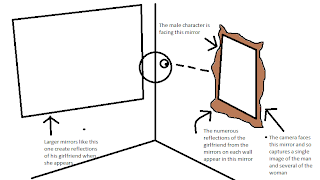


    The way that it looks like there are several copies of the girl in the room give an effect of the male character being surrounded. The girl is intended to be a form of the monster, built up from the male character's subconcious, because he is grieving his ex-girlfriend, and she is what he is thinking about at that time which is what creates the particular form the monster assumes. This is what leads to the problem with this shot. At the time of writing, we only have a static sequence where the girlfriend suddenly appears. Our feedback after showing this to our teacher was that if she was a construct of his mind (to some extent), we have not made this clear in what we have filmed so far.

    To solve this we could do a number of things. After some research, a common way of taking the viewer into the character's mind is a close-up shot. But we could take this further by zooming in to the character's face (or even their eye, for example if we were to be explicit in showing this is in the character's mind) and when the shot reaches the level of zoom we want it to, the shot can suddenly change and reveal the girl, making it clear that after we have passed through the character's mind, we see what he imagines.

    Alternatively, we could use editing to solve this problem. Warping the shot or soundtrack in a very subtle way could give the effect we are looking for, by distorting the reality of the shot which we have at the moment, the audience can tell it is being skewed in some way and the obvious assumption is that the character's mind is perceiving events that are not reality.

    The camping/forest scene that was partially described in the storyboard post was believed to be effective by our group and teacher, but one issue was that it would have been a lot more unsettling and conventionally frightening if it was shot at night. Our experiences last year of filming at night were that we needed some kind of low-key light source to make sure that the fact it is being lit is not distracting from the action. The location of the camping scene was far from any street lamps or unnatural light, so it is very difficult to make it light enough to see, but not look like it is artificially lit. Currently we are thinking of re-filming this scene as well, by adjusting the white balance on the camera we think it will enable us to shoot a visible scene at night.

    Aside from these main issues, there are instances in our footage where a camera is visible in a reflective surface, for example. To iron this out at the editing stage compromises other elements of the shot if we are cropping, so we have decided to film this section again. This also gives us a chance to improve the connection between the two characters in the sequence and give a greater sense of the action happening in the male character's mind.