Tuesday, May 3, 2011
Tuesday, April 5, 2011
Monday, April 4, 2011
Film Poster
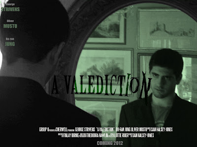
The main difference between the draft and our final poster is the inclusion of an especially designed title. The concept behind this reflects the theme of sanity that is prevalent in the film. It starts out straight and uniform, but slowly changes and turns into something more sinister and deranged. This also fits with the concept of a teaser trailer, as it gives the audience a taste of what is to come without actually telling them anything specific.
Magazine Cover
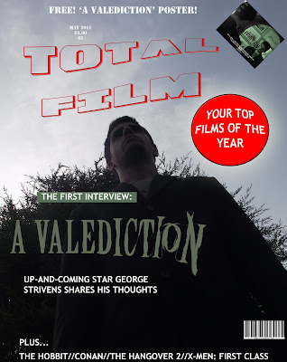
This is our magazine cover, created in Adobe Photoshop. We took inspiration from 'Empire' magazine as this is a universally acclaimed and renowned publication. We have continued using the contrasting colours of green and black in order to maintain synergy with both our other ancillary tasks and our main project.
EDIT: The poster was changed to avoid copyright infringement issues - the title is now an original design rather than using the Empire typeface.
Wednesday, March 30, 2011
New Poster - Draft
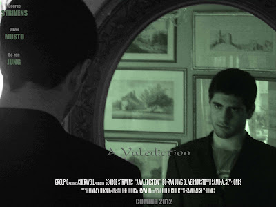 This is the first draft of our film poster afterour second photo shoot. We tried to match the tone of the main piece of our film by using green, grey and black colours. The font for the title is only temporary, as we will use a custom font in the final piece.
We have followed several conventions of film posters, including using the 'Steel Tongs' font that is universally used on film posters and is instantly recognizable.
Monday, February 14, 2011
Poster,First Attempts
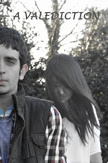
These are our final designs for the film poster. Although we agree that both them would work in targeting our target audience, we decided that we should go with the poster that shows both of the main characters and is more aimed at our target audience.
Wednesday, February 9, 2011
Poster Pictures, Unedited
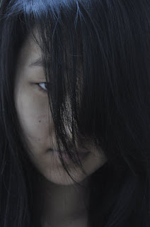
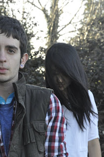
These are some of the pictures that we thought we could use for our film poster; however they have not been edited yet.
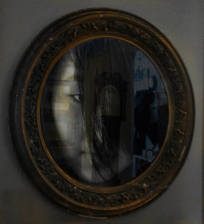
Some of the ideas that we had for the poster was that for the picture showing the two main characters we would fade the colour a little to make it look dimmer and have the female character seem as if she was see through and more ghost like. This would then relate back to the main teaser trailer.
Another idea that we had was that for the other picture of the female characters face, we would add it in to another picture that we took of a mirror to seem as if she was in the mirrors reflection looking out at the audience.
Teaser Take 2 - A Valediction
For our second take on our teaser, we have added a scene to try and connect the character shown in the mirror to the the forest. We have also changed the title screen, although the font we have used IS subject to change very soon. This alludes to the 'Wilderness vs Civilisation' idea that we had when we were first brainstorming for film ideas.
Film Title: A Valediction
The title was inspired by the poem 'A Valediction Forbidding Mourning' by John Donne. This poem was written to his wife before he went to travel around Europe. The first stansa for this poem is:
As virtuous men pass mildly away,
And whisper to their souls to go,
Whilst some of their sad friends do say,
"Now his breath goes," and some say, "No."
This stansa plays on the aspects of death that are uncertain, or unexplained. This is, in essence, the basis for our film. Because of these two meanings we felt that this title was the right one for or film.
Poster: Editing Stage
We started out by going into a field and taking a few pictures of the two main characters standing near a wooded area. We thought that this would be a suitable location to take a few photos because part of our film is based in the woods and it would relate to the film. We then decided that we should go to a different location to find some more ideas. Our next location was at a friend’s house where we had originally filmed the trailer, we decided to take a few shots of the mirror because this was a big part of the trailer that the audience could see straight away and relate to. As this went on we thought of the idea of the main female characters face being shown in the mirror, but not as a real person, but as the ghost that is haunting the main character. For this we asked Lottie if she could somehow make it as if she was faded in the mirror to give the ghost like effect.
At the moment we are still in the editing stage so do not have any photos uploaded at the moment, but we are close to coming up with a final idea for our film poster.
Wednesday, February 2, 2011
Poster - Creating the first draft
Tuesday, January 25, 2011
Feedback programme
Thursday, January 13, 2011
How to create a professional movie website
How to Make Your Movie Website
Identify your target audience and narrow down domain names based on tone, scope, and specificity. If the website is dedicated to a single movie, try to work the title into the domain name. Choose a web host that has hosted other movie sites with something in common with yours, such as genre or style.
Build the technical side of your website with a website building program or by composing HTML or CSS code yourself. (If you feel uncomfortable working with either a program or code, solicit the help of a trained site-builder who can give your site a professional sheen.)
Create an opening (or splash) page to not only greet visitors but clearly express the purpose the film and website. Some dramatic image from the film can only help. This page should include tabs that lead to reviews from reputable sources, videos including interviews and trailers, and, if possible, theater listings.
Insert all the information a casual fan would want to know on tab pages. This would include a list of the cast and production crew (with names spelled correctly), a well-written and compelling description of the premise, a professionally edited trailer, a summary of festivals or other places the film has or will play and production information.
If your film has been rated, place it visibly, but not prominently, near the production information. If you get reviews, and they're positive, post quotes from them, giving appropriate credit to the reviewer and a link if possible to the full review. If the film has been nominated for any awards, or won any, that information should be on your opening page.
Convert any recorded materials (commercials, interviews, etc.) into a smaller, compressed flash video that will be easier and more convenient for viewers to see. Ease and quality will be very important values to keep casual viewers at your site. Create a design for your flash video player that fits well with your project.
Upload your website with a file transfer protocol. Many web hosts offer this feature, but if they don't you can download an FTP program yourself.
Read more: How to Make a Movie Website | eHow.com http://www.ehow.com/how_5592722_make-movie-website.html#ixzz1AuiwmvI8
Wednesday, December 29, 2010
Cape Fear (1961)
- A notable disparity between civilisation and the wild
- A protagonist pursued relentlessly by someone/something from their past
- Horror based on shock and suspense
- A final "showdown" set far from the city/home of the characters
Thursday, December 9, 2010
How are features of a film website arranged?
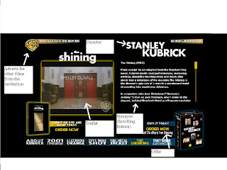
The Shining
This website of The Shining is from a larger Warner Bros. hub and is sorted by director; it is on the Stanley Kubrick page, who has a heavy influence on the webpage. His name comes up in bold capitals at the top of the page, because the style of The Shining is highly specific to Kubrick and the title-like presentation of the director categorises the film into that style on the website as well.
The bulk of the page is taken up by a trailer and synopsis, the two largest elements of a site in terms of explaining the film to the user. The scrolling synopsis allows the components of the site to be fitted in compactly into one screen, attracting a more casual audience to read it.
As many other film sites are, this is very commercial. The page has several links to buy films from warner bros. and links to other productions on the larger hub, maximising the sales and only providing the basic information.
Our film currently looks like it could lean towards two kinds of target audience. 1: An audience who like coded horror, for example, The Wicker Man, where wilderness and civilisation parallel insanity and sanity as in our teaser. 2: An audience who watch movies like The Grudge, as the lingering image of the girl in the dark is very similair to other contemporary horrors involving young girls as monsters. We will choose one of two very different website styles to direct the film to its target audience, using similarities to films like The Wicker Man and The Grudge to mould that style.
